
The Collector’s Guide: Which Print Material Fits Your Space?
Choosing the material that best serves the photograph and the space where it will live.
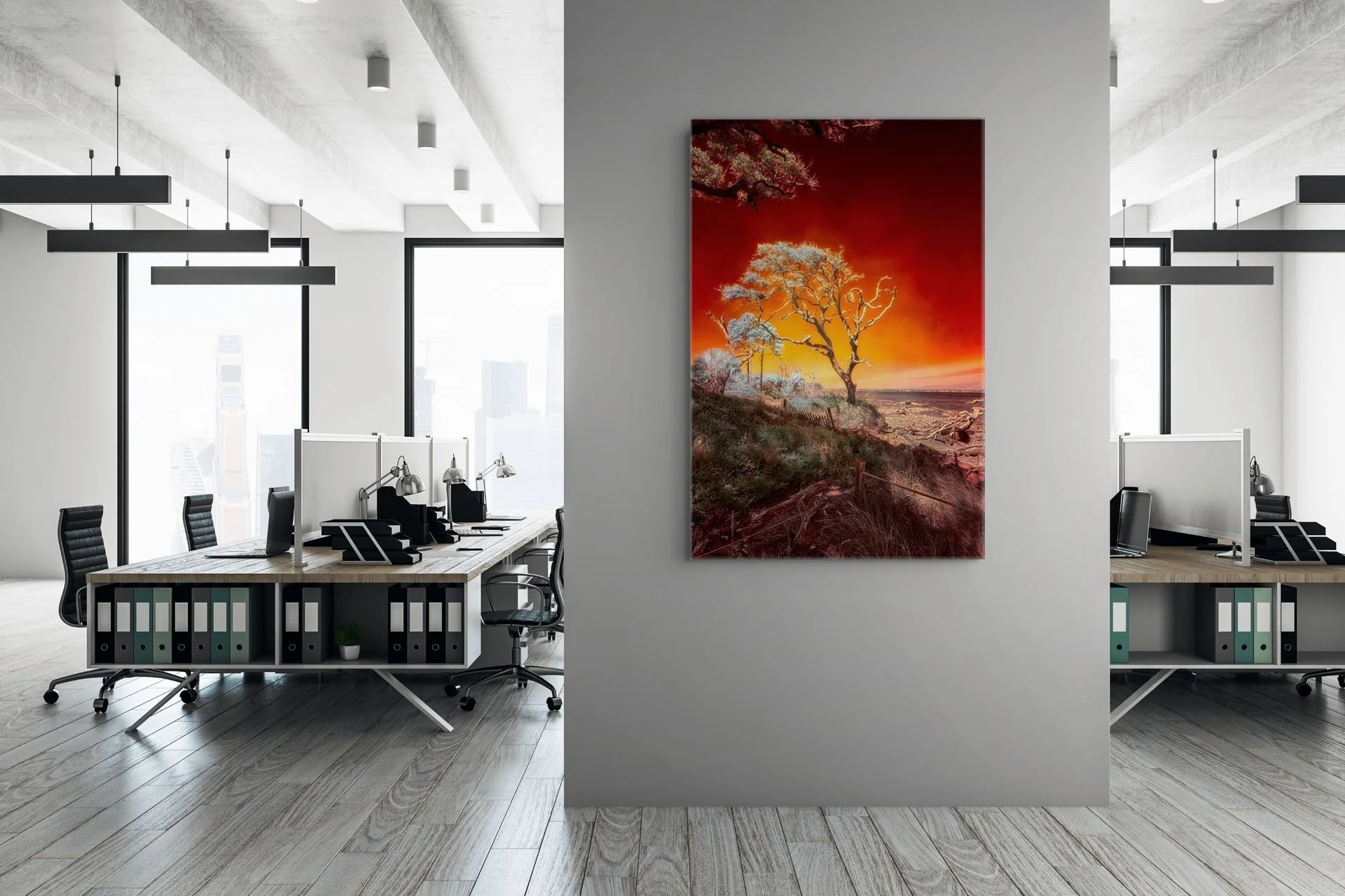
Ruby Bonsai - Printed on a White Aluminum medium
After years of making, printing, hanging, and living with photographs, I have learned that choosing an artwork is only part of the journey. The material on which it is printed becomes part of how the photograph is experienced.
A quiet image on fine art paper can feel intimate, almost like a page from a private dream. The same photograph on metal may carry more light and presence. Acrylic can create a sense of depth, while canvas brings texture and a softer fine-art character.
None of these is universally better than another. The right choice begins with the photograph.
Begin With the Photograph
Before considering the room, the frame, or the finish, spend a little time with the image itself. Notice what keeps drawing you back. Is it the color, the silence, the texture, the subject, or the feeling held inside it?
Some photographs ask for a surface that is quiet and understated. Others come alive when color is given more luminosity. A black-and-white image may take on an entirely different character when its pale areas reveal the silver beneath a brushed-metal print. A woodland photograph may gain atmosphere from natural grain. Another subject may feel completely wrong on wood, no matter how beautiful the material is on its own.
I do not treat materials as interchangeable upgrades. I choose them image by image, asking which surface will allow that particular photograph to speak most clearly.
Metal: Three Different Ways of Holding Light
Metal is often described as one category, but the three metal surfaces I use have very different personalities.
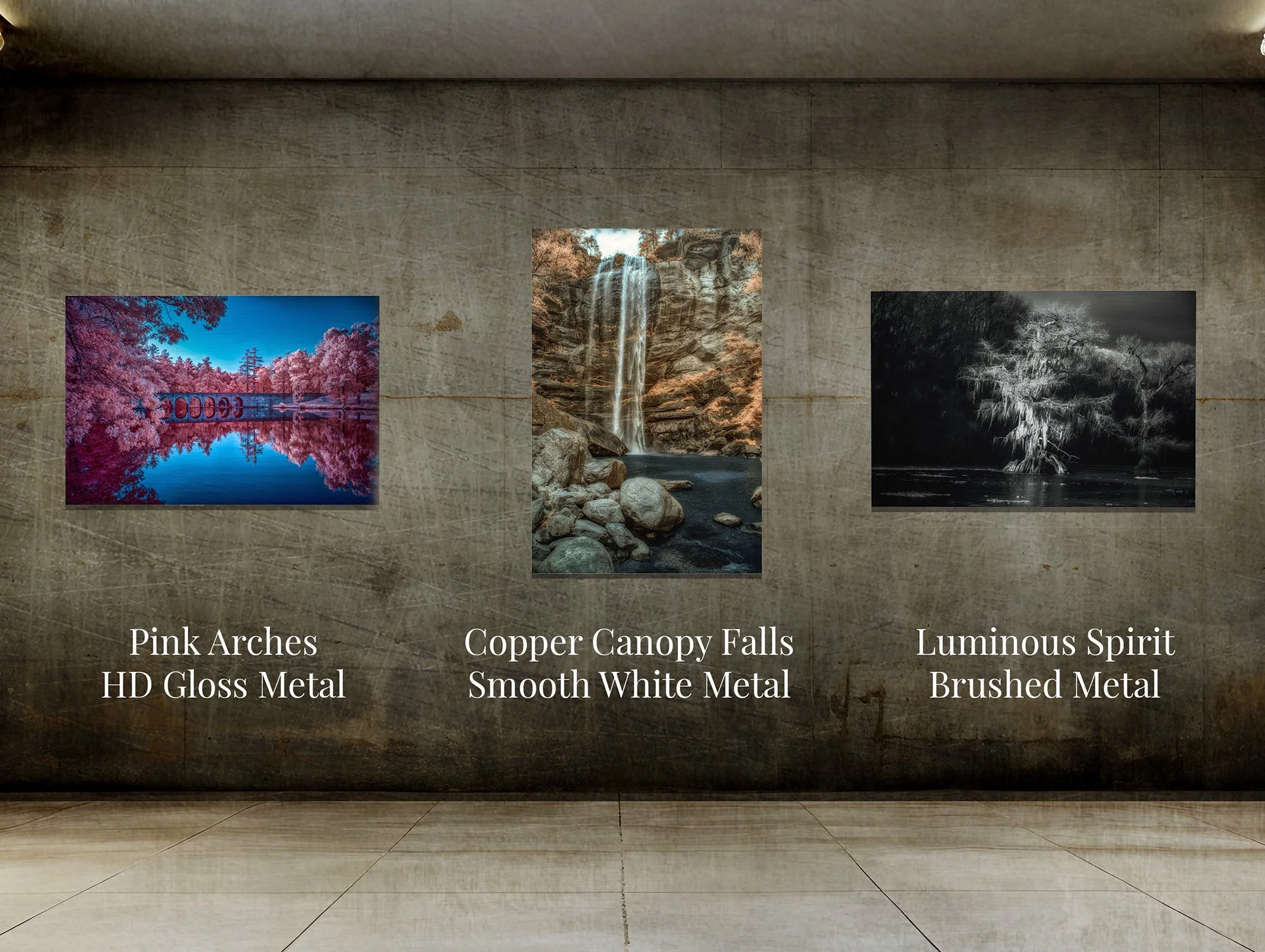
Smooth White Metal
Smooth White Metal gives color a wonderful sense of life while retaining a more matte presence than a high-gloss finish. To my eye, it has a tactile quality; the surface feels more textured and less like a mirror. It can give an infrared photograph real color presence without allowing shine to become the subject.
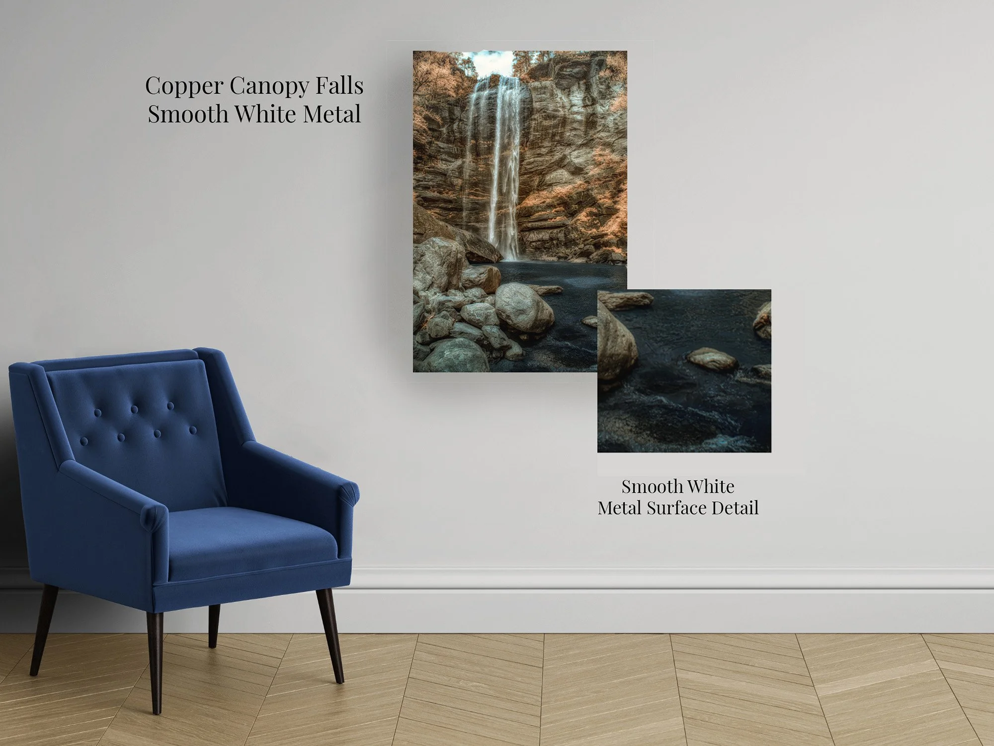
Copper Canopy Falls on Smooth White Metal
Smooth White Metal gives Copper Canopy Falls rich color and clarity while retaining a quieter, more matte presence. The surface strengthens the warm copper tones, cool water, and delicate movement of the falls without adding distracting reflections.
Brushed Metal
Brushed Metal can be especially beautiful for black-and-white photographs. The pale and white areas allow the silver character of the aluminum to show through, becoming an active part of the image.
Used with the right photograph, that effect can feel luminous, elemental, and unlike an ordinary photographic print.
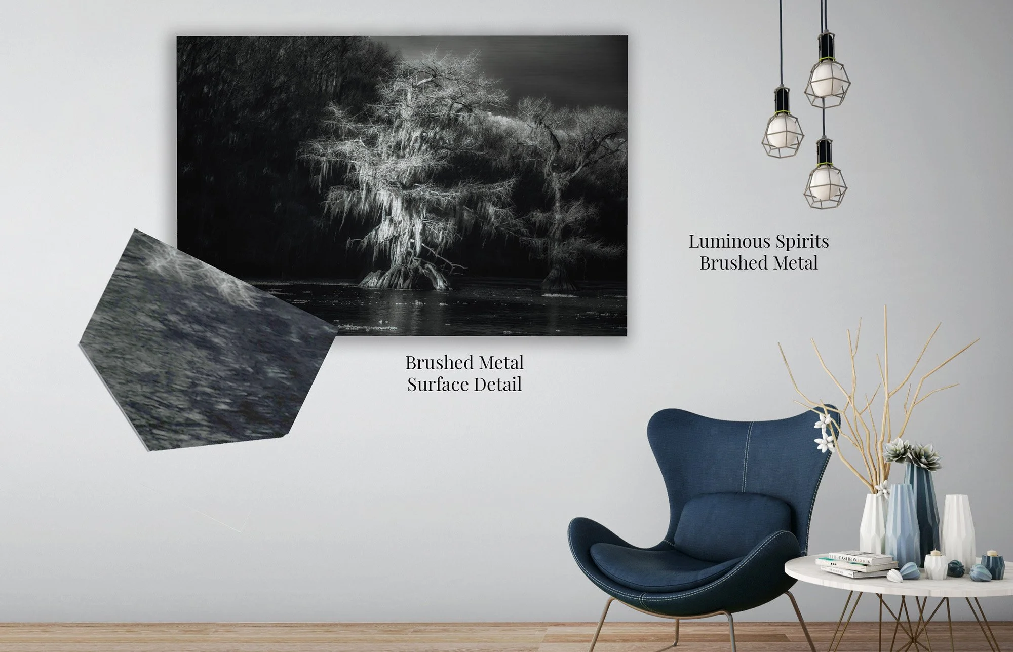
Luminous Spirits on Brushed Metal
Brushed Metal gives Luminous Spirits an ethereal, almost otherworldly presence. The aluminum reveals itself through the lightest branches, adding a silvery luminosity while allowing the ancient cypress and surrounding darkness to remain the heart of the image.
HD Gloss Metal
HD Gloss Metal produces bold color, deep contrast, and a polished surface. It is popular at art fairs, and many collectors are drawn to its immediate visual impact.
I use it more selectively. In a brightly lit room, a glossy surface can reflect the viewer or the surroundings. I want you to see the photograph—not your reflection competing with it.
For certain images and spaces, HD Gloss can be striking. For others, a quieter metal surface serves the work more faithfully.
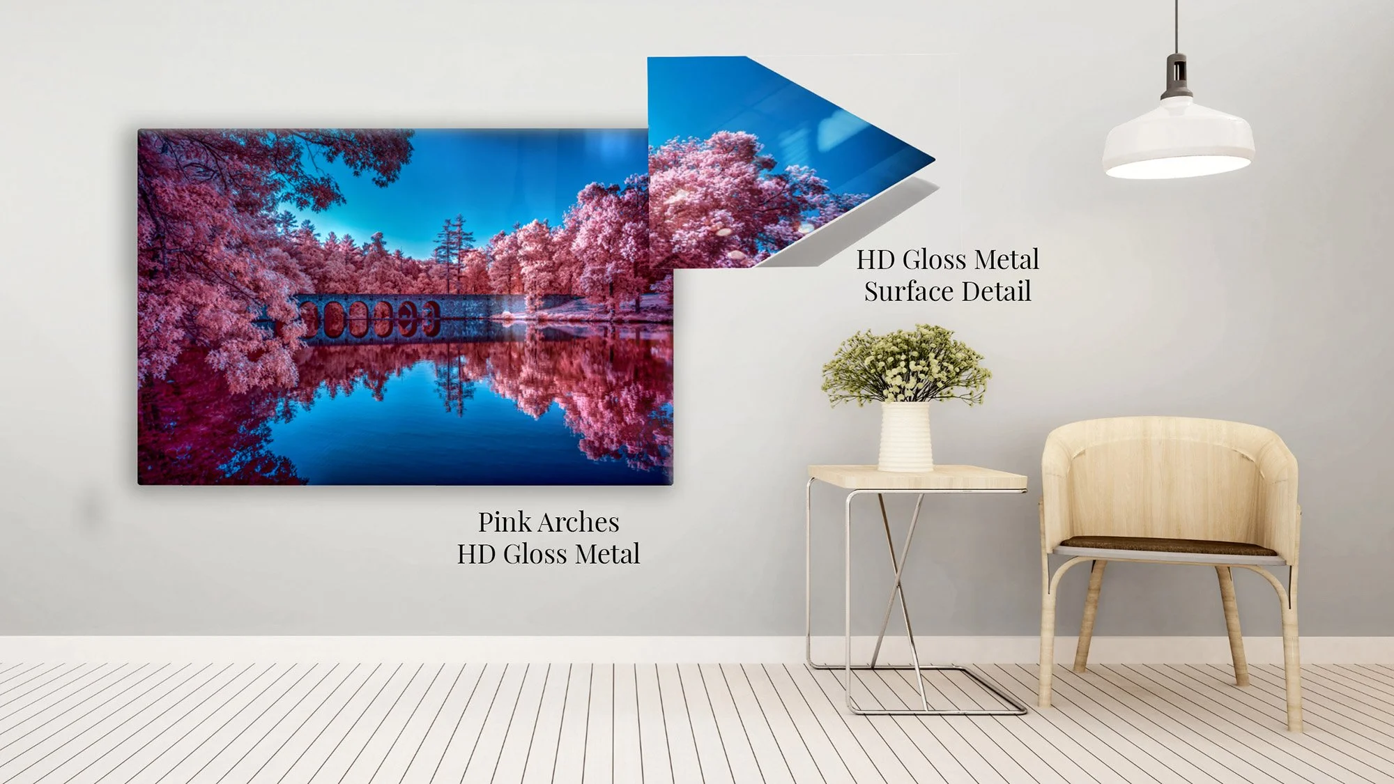
Pink Arches on HD Gloss Metal
HD Gloss Metal gives Pink Arches bold color, deep contrast, and a luminous contemporary presence. The polished surface intensifies the vivid pink foliage, blue sky, and mirrored water, creating an image with immediate visual impact.
Acrylic: A Sense of Depth
Acrylic has a contemporary presence, but what interests me most is the dimensional quality it can give a photograph. Viewing the image through the acrylic creates a sense of depth—almost a three-dimensional feeling—as though the photograph exists a little beyond the wall.
Glossy acrylic intensifies that polished effect, but it can also create stronger reflections. I personally prefer non-glare acrylic for many images because it preserves much of the depth while making the photograph easier to see under varied lighting.
Still, as with metal, I make the choice according to the image. Occasionally, a photograph benefits from the brilliance of a glossy presentation.
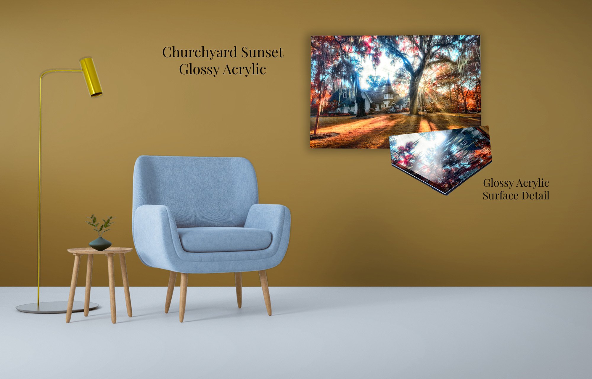
Churchyard Sunset on Acrylic
Acrylic gives Churchyard Sunset a luminous sense of depth, allowing the radiant light, vivid foliage, and shadowed church to feel almost three-dimensional. The polished presentation strengthens the photograph’s contemporary presence while preserving its atmosphere of warmth, mystery, and stillness.
Canvas: Texture and a Fine-Art Feel
Canvas brings texture into the experience of a photograph. It has a softer, more tactile presence that can feel closer to traditional fine art than to a conventional photographic print.
It is also one of the most accessible ways to begin collecting substantial, ready-to-hang wall art. Canvas does not require glass, and its dimensional form gives it a finished presence on the wall without demanding an additional frame.
For dreamlike landscapes and quieter images, that textured surface can feel especially natural. It softens the boundary between photography and memory—the place where much of my work begins.
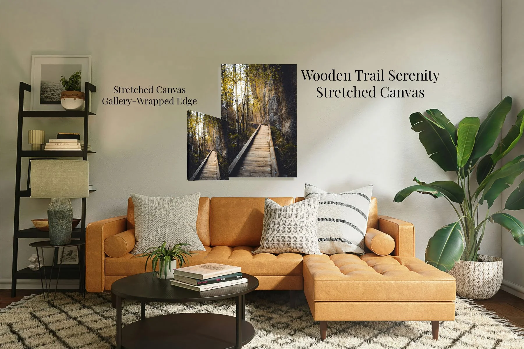
Wooden Trail Serenity on Stretched Canvas
Stretched Canvas gives Wooden Trail Serenity a warm, tactile fine-art presence. The canvas texture complements the weathered boardwalk, autumn foliage, and rugged stone, while the gallery-wrapped edge allows the photograph to arrive ready to display without an additional frame.
Fine Art Paper: Quiet and Intimate
Fine Art Matte Paper is my personal favorite among the paper choices. Its restrained surface does not announce itself. It gives the photograph room to breathe, allowing tone, color, and detail to be experienced without a strong sheen.
Framed thoughtfully, it has an intimate, enduring presence.
Satin Photo Paper offers a more familiar photographic appearance. It carries color well while limiting some of the glare associated with a glossy print. For collectors who love the traditional feeling of photography, satin can be a natural choice.
Pearlescent Metallic Paper has a more luminous, distinctive character. It can bring an appealing shimmer and depth to selected photographs, but I use it sparingly. Its personality needs to belong with the image rather than being added simply for effect.
Paper prints are the presentation I most naturally prefer to frame. The frame gives the print protection and presence while creating a quiet transition between the artwork and the room.
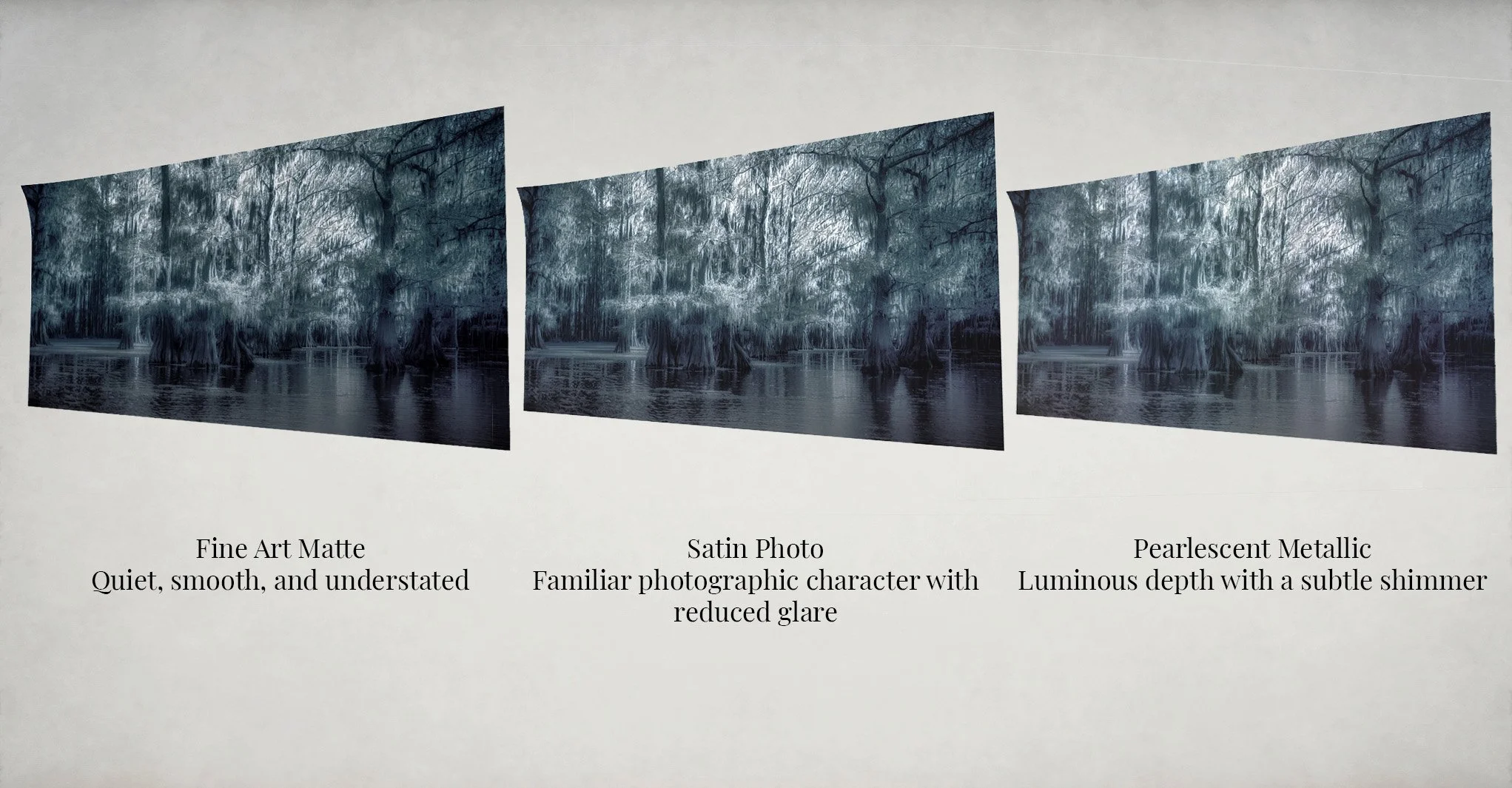
Twilight Between Worlds - Fine Art Paper Print Comparison
The same photograph takes on a different presence across three paper surfaces. Fine Art Matte feels quiet and understated, Satin Photo offers familiar photographic character with reduced glare, and Pearlescent Metallic adds luminous depth with a subtle shimmer.
Wood: Texture, Color, and Mood
Wood is not a neutral surface, and that is precisely what can make it special. Its grain can add texture, a subtle color overlay, and an atmosphere of its own.
For the right woodland, landscape, or nature-inspired image, the material and subject can seem to belong to one another. The photograph is no longer merely resting on the wood—the wood becomes part of its mood.
Because that relationship is so specific, I offer wood only when I believe it genuinely strengthens the photograph.
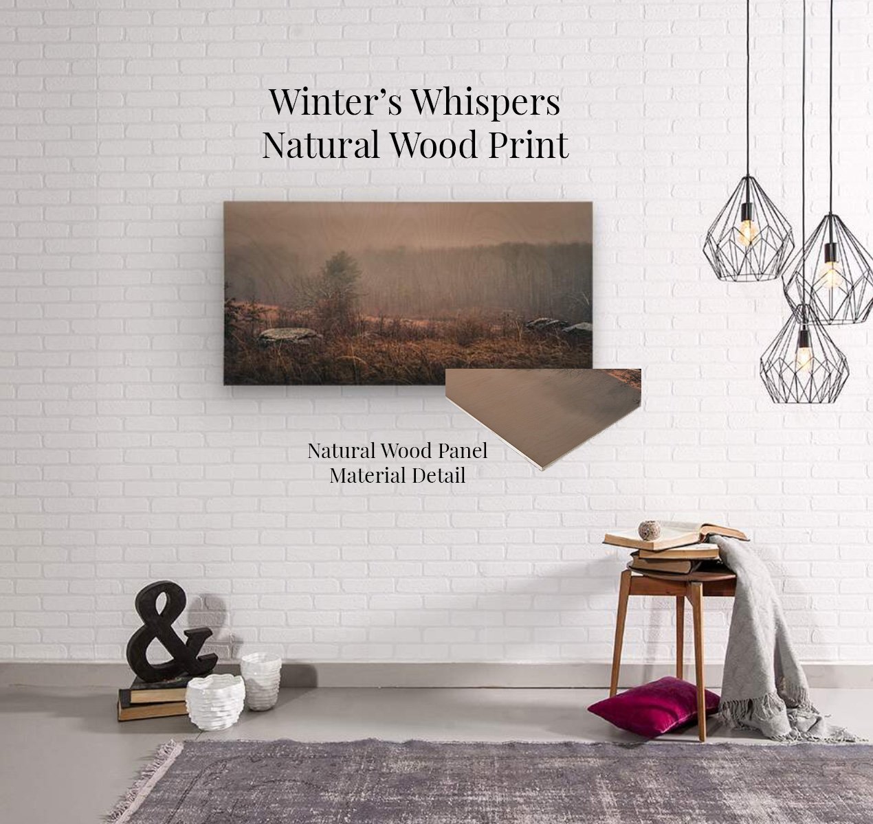
Winter’s Whispers on Natural Wood
Natural Wood gives Winter’s Whispers added texture, warmth, and atmosphere. The visible grain and subtle color of the wood become part of the photograph, deepening the muted grasses, drifting mist, and quiet solitude of the winter landscape.
Deckled-Edge Limited Editions
For selected limited editions, I offer a deckled-edge fine art presentation that I find especially beautiful. The paper is finished with a hand-torn edge and floated within the frame, leaving space around the print so its physical character remains visible.
I ordered a sample before deciding to offer it. What moved me was the sense that the photograph had become an object in its own right—something carefully made, held within the frame, yet given enough space to breathe.
It is a presentation I reserve for selected images and editions where that added intimacy feels true to the work.
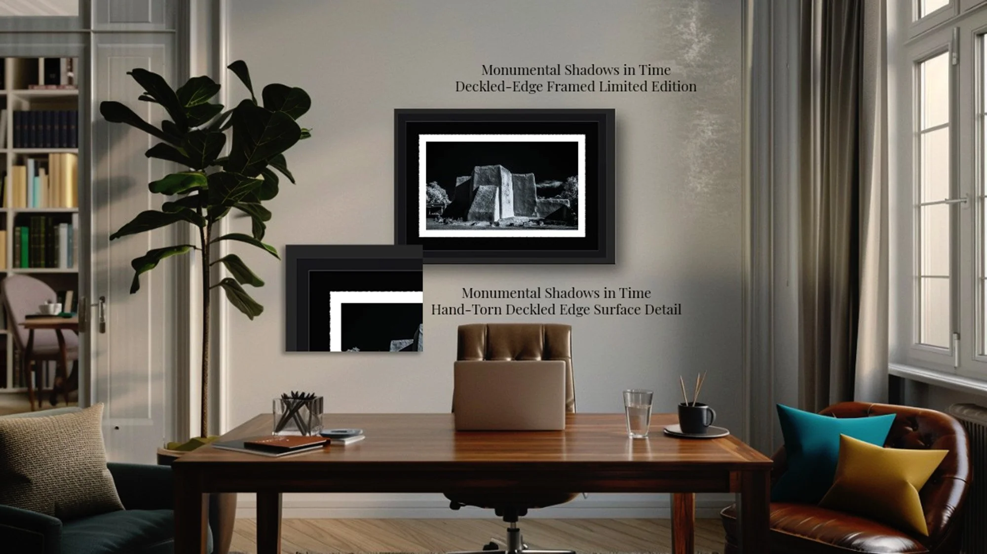
Monumental Shadows in Time — Deckled-Edge Framed Limited Edition
This limited-edition presentation gives Monumental Shadows in Time an intimate, museum-inspired presence. The hand-torn deckled edge remains visible as the fine art print floats within the deep black mat and frame, emphasizing the luminous adobe architecture and creating a quiet sense of depth, permanence, and reverence.
Let the Room Enter the Conversation
Once the photograph has led the decision, consider the room where it will live.
A calm, softly lit room may welcome a contemplative image on canvas, framed fine art paper, or Smooth White Metal. The texture and quieter surface of canvas and paper can deepen the sense of stillness already present in the photograph, while the soft texture and matte character of Smooth White Metal add gentle color presence without introducing distracting reflections.
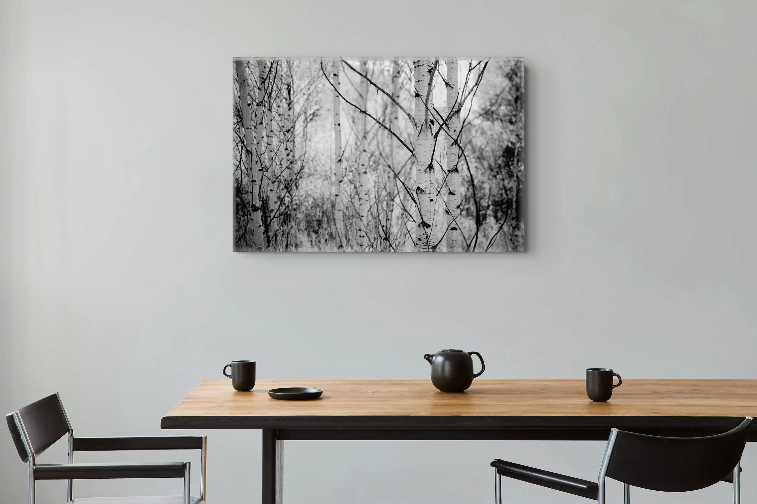
Written in Bark and Branch in a Minimalist Dining Room
Contrasts in Woodland Quiet brings a delicate rhythm of pale birch trunks and dark crossing branches into this restrained dining space. Its quiet black-and-white palette complements the room’s clean lines while inviting the eye to wander deeper into the woodland.
A bright, contemporary room may be well suited to a more colorful infrared image on metal. Its clean presentation and vivid color can hold their own within the space. Brushed Metal responds beautifully to changing light, revealing a subtle shimmer as daylight moves across its surface. Glossy finishes behave differently, reflecting windows, lamps, and even the viewer more directly. In a room filled with shifting light, consider whether you prefer the evolving metallic character of Brushed Metal, the bold polish of HD Gloss, or the quieter viewing experience of a matte or non-glare surface.
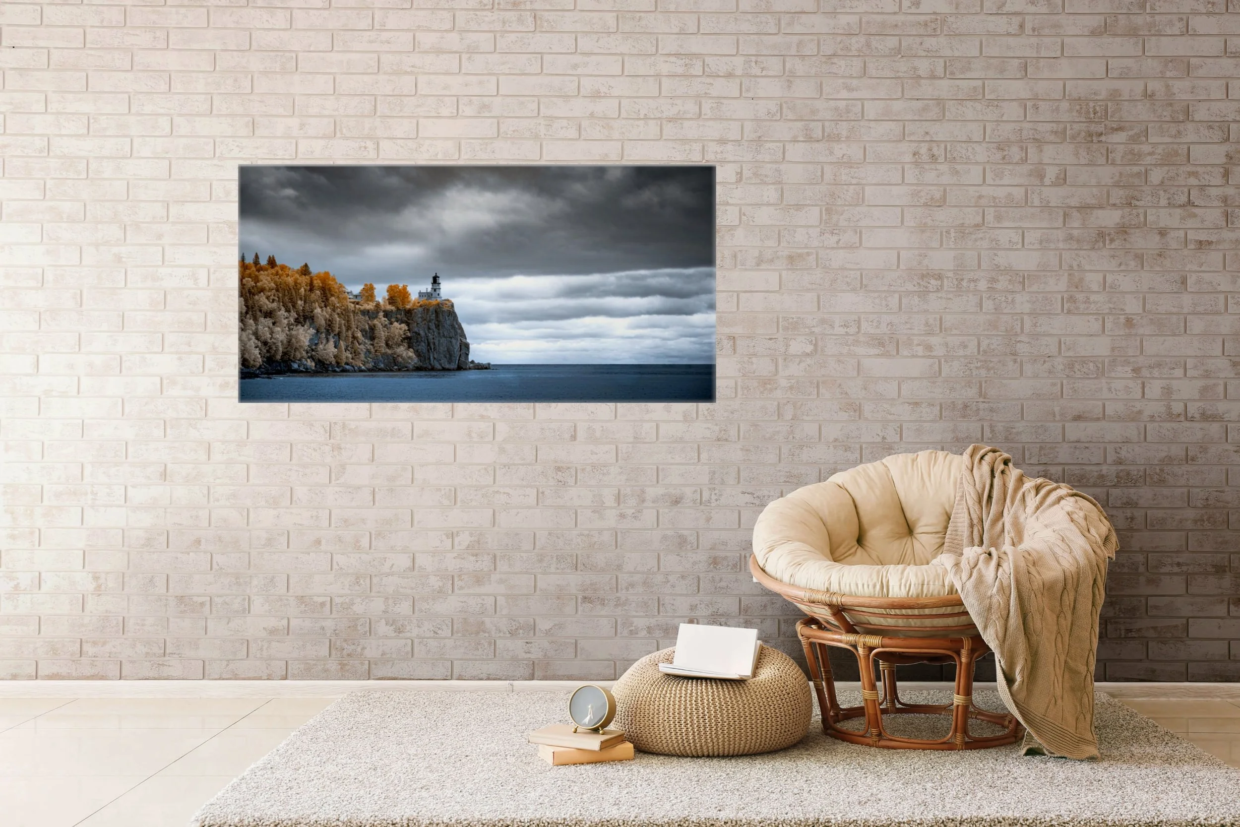
Golden Light at Split Rock in a Warm Contemporary Room
Golden Sentinel at Split Rock brings a feeling of distance, solitude, and watchfulness to this softly furnished room. The warm autumn trees surrounding Split Rock Lighthouse stand against the cool water and brooding sky, giving the peaceful space a gentle sense of drama.
Lighting matters, however. Windows, lamps, and viewing angles can make glossy surfaces more reflective. In a room filled with shifting light, a matte or non-glare surface may allow a more comfortable view throughout the day.
Your own taste matters, too. Some collectors are drawn to quiet texture. Others love luminous depth, visible metal, or the familiar intimacy of paper.
The goal is not to follow a rule. It is to find the meeting place between the photograph, the material, and the life of the room.
Five Questions to Help You Choose
If you are deciding between materials, begin here:
Which photograph continues to draw you back?
Which surface preserves or deepens the feeling you found in it?
How much natural and artificial light reaches the wall?
Are you drawn to quiet texture, luminous depth, metallic character, or a traditional paper print?
Do you want the artwork framed, or would you prefer it to stand independently on the wall?
There is no universal best material. There is only the presentation that allows you to keep seeing—and feeling—the photograph.
If you are drawn to an image but envision it in a different material than the options shown, please reach out. I would be glad to help you explore a presentation that suits both the photograph and your space.
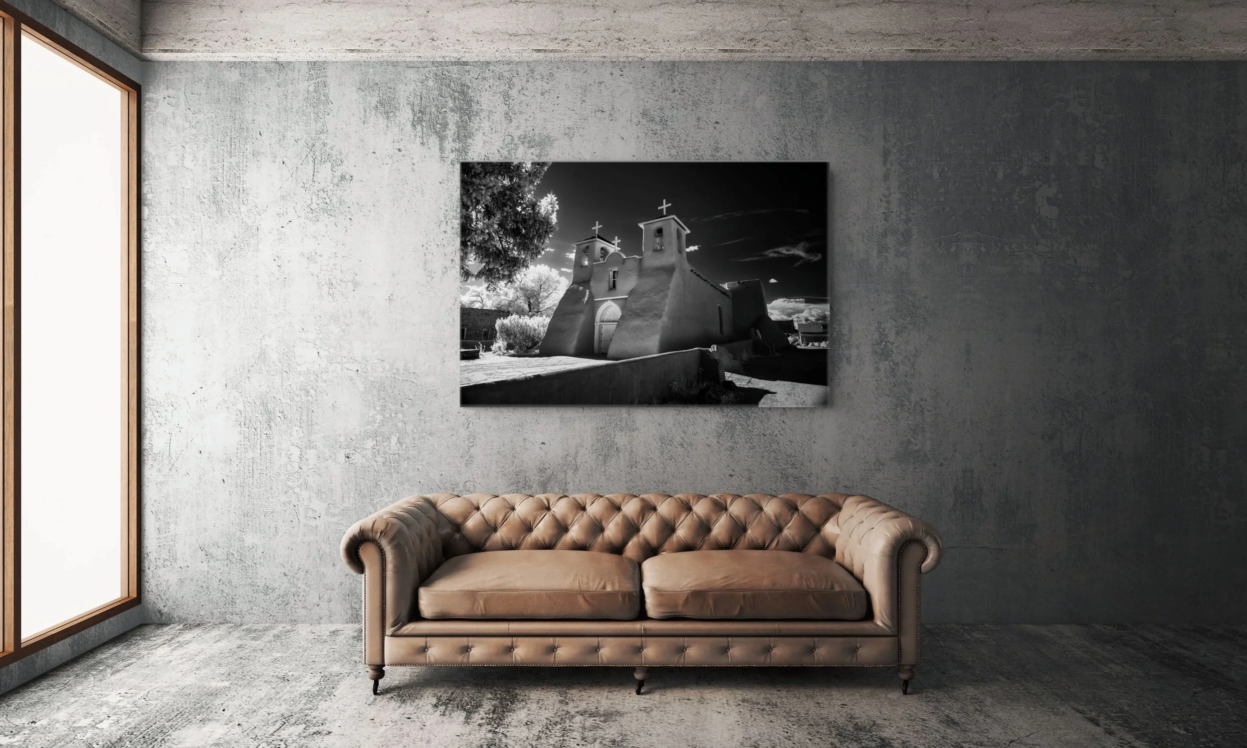
Sanctuary of Timeless Shadows in a Contemporary Living Room